Maximizing Linkedin Document Ad Appeal

Tim Hübler
Oct 29, 2024
𝐌𝐚𝐱𝐢𝐦𝐢𝐳𝐞 𝐘𝐨𝐮𝐫 𝐋𝐢𝐧𝐤𝐞𝐝𝐈𝐧 𝐃𝐨𝐜𝐮𝐦𝐞𝐧𝐭 𝐀𝐝𝐬 𝐏𝐞𝐫𝐟𝐨𝐫𝐦𝐚𝐧𝐜𝐞 𝐰𝐢𝐭𝐡 𝐎𝐩𝐭𝐢𝐦𝐢𝐳𝐞𝐝 𝐓𝐢𝐭𝐥𝐞 𝐏𝐚𝐠𝐞𝐬
When it comes to 𝐋𝐢𝐧𝐤𝐞𝐝𝐈𝐧 𝐃𝐨𝐜𝐮𝐦𝐞𝐧𝐭 𝐀𝐝𝐬, the title page isn't just a cover of the pdf - it's your 𝐜𝐫𝐞𝐚𝐭𝐢𝐯𝐞 𝐬𝐞𝐜𝐫𝐞𝐭 𝐰𝐞𝐚𝐩𝐨𝐧 as it literally gets used as the image creative! Here are some tips and tricks to design eye-catching title pages.
We at Muhlert Digital GmbH love using Document Ads as a powerful mid-funnel strategy to generate highly engaged leads for e.g. account-based marketing campaigns. By leveraging the tips and tricks below we’ve consistently seen impressive uplifts in CTR, lead volume and substantial reductions in cost per lead by optimizing title page formats, creating engaging visuals, and using strong CTAs.
𝐅𝐨𝐫𝐦𝐚𝐭𝐬 𝐌𝐚𝐭𝐭𝐞𝐫
Your main document can and should stay vertical (US Letter, DIN A4), but consider a 1:1 square or 1.91:1 landscape format for the title page. These formats work better as creative sizes in LinkedIn catch the eye and drive those all-important clicks.
1. 𝐃𝐨𝐜𝐮𝐦𝐞𝐧𝐭 𝐨𝐧 𝐃𝐞𝐬𝐤/ 𝐖𝐨𝐫𝐤𝐬𝐩𝐚𝐜𝐞 𝐒𝐜𝐞𝐧𝐞
Create a professional, top-down workspace layout with your document on a desk, surrounded by familiar objects like notebooks, pencils, or tech gadgets.

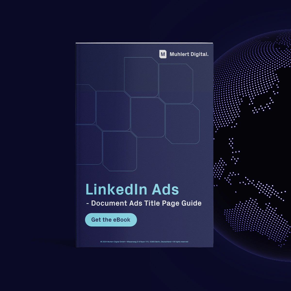
2. Cover Display
Use a clean, centered design for the title page. Choose neutral or brand-specific colors and let the document cover take the center stage. A minimalist design works well, or you can opt for a bolder background to create visual impact.
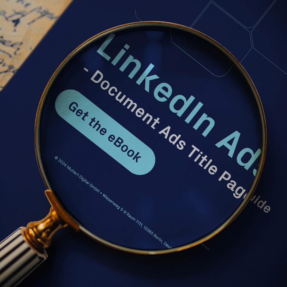
3. Magnifying Glass Focus
Add a magnifying glass effect on the title page to spotlight a crucial detail or statistic. This draws viewers in and highlights the value of what’s inside. Position your CTA button near this focal point to encourage clicks.
4. Hero Image with Typography & Benefits
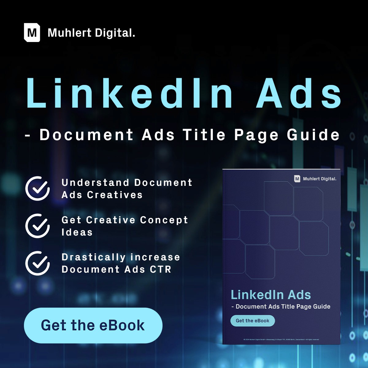
Pair a striking background image related to the document’s topic with bold typography. Emphasize key promises or benefits, shifting the focus from the document cover to what it delivers.
5. Before-and-After Transformation
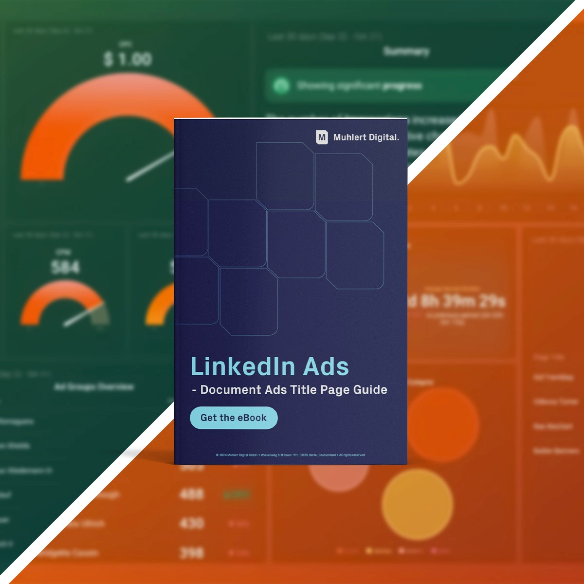
Showcase a visual comparison to illustrate the impact of the document. For example, if it’s about AI in business, show a "before and after" of a business dashboard. Place the document cover between or above the two images for a clear connection to the transformation.
6. Progress Bar Teaser
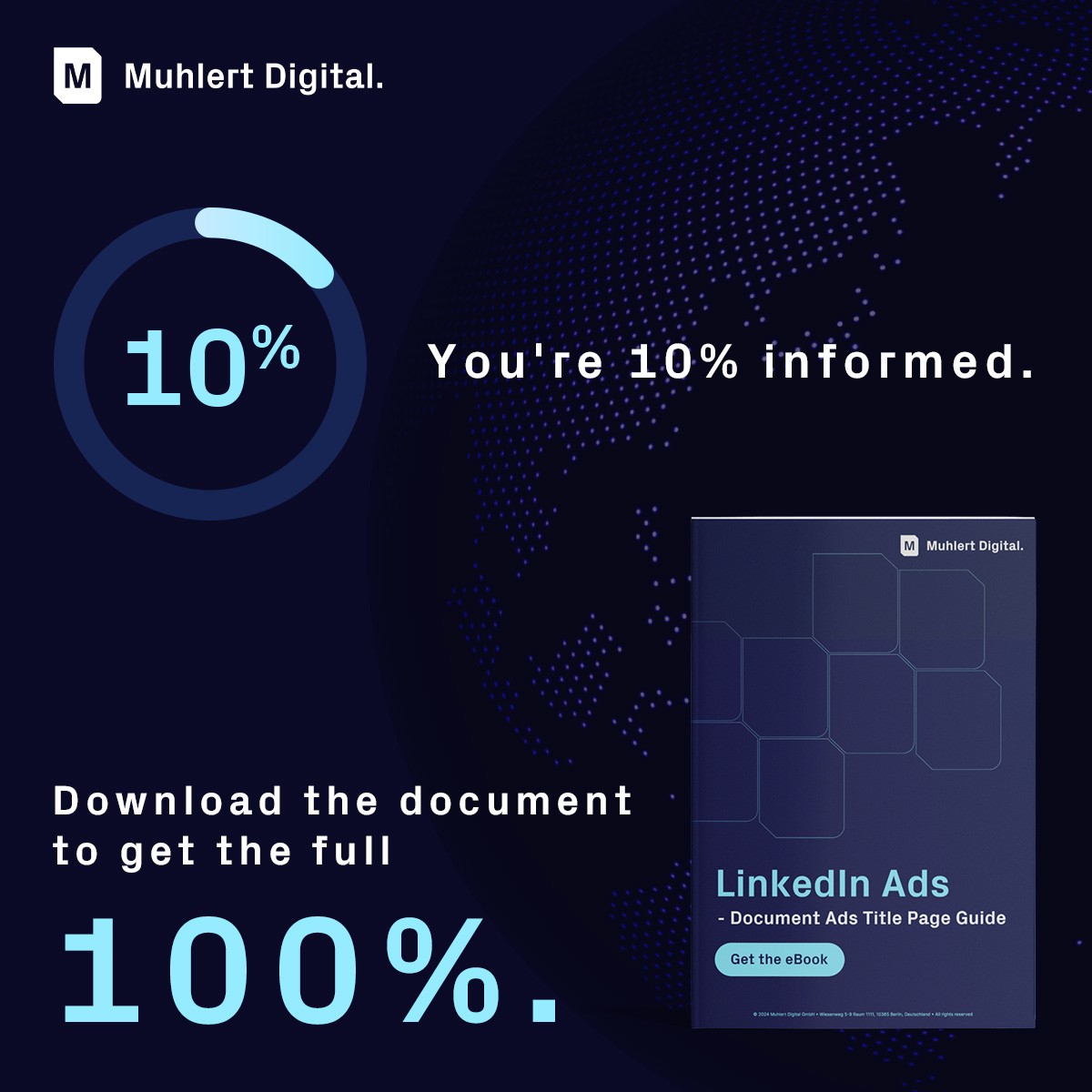
Use a visual cue like a progress bar to hint at the knowledge or insights within. For example, "You’re 10% informed. Download the document to get the full 100%." Place the document cover alongside for context.
7.Testimonial or Case Study Overlay
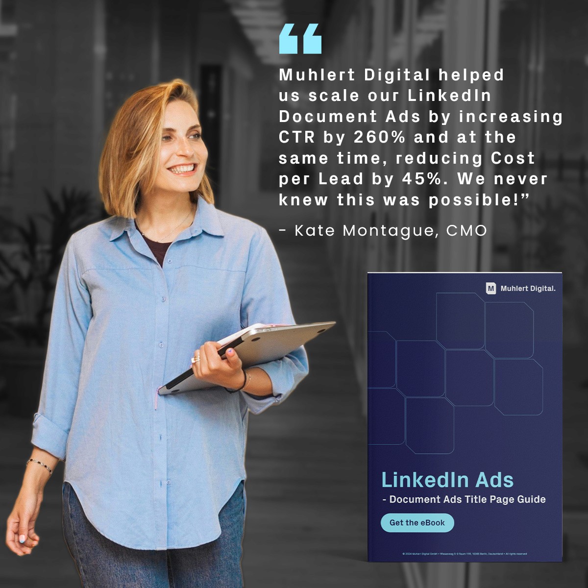
Highlight a compelling quote or case study snippet over the document cover. This is perfect if your document includes success stories, tips, or real-life applications, adding credibility.
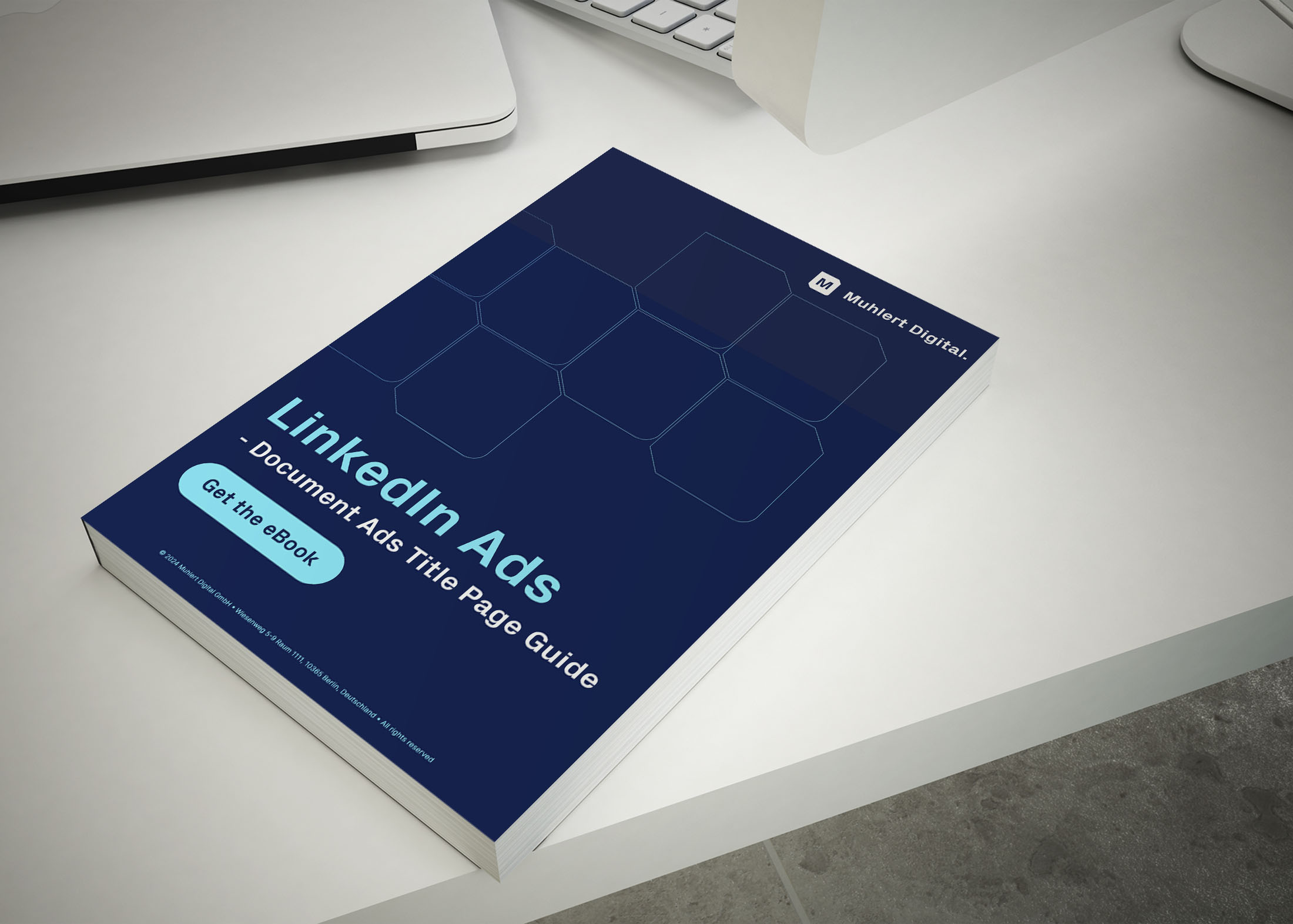
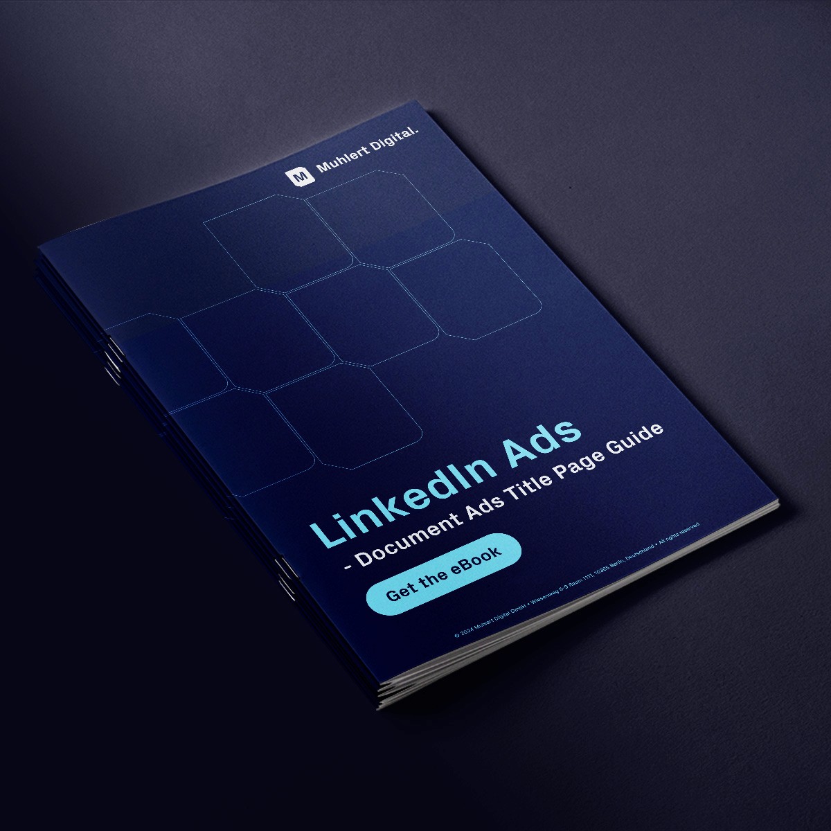
8. 3D Book Mockup with Depth
Create a 3D book mockup of your document cover, adding depth and making it feel tangible. Surround it with on-brand elements or textures to enhance the visual appeal.
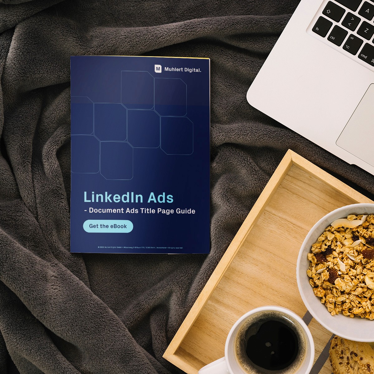
9. Cozy Setting/ Start of the Day
Show your document in a cozy setting - like a workspace with a warm drink and a notebook. It gives a sense of starting the day right with valuable knowledge in a relaxed, focused way.
